Heatmap & InStore Analytics
Overview
Optimize Your Customers’ Path To Purchase
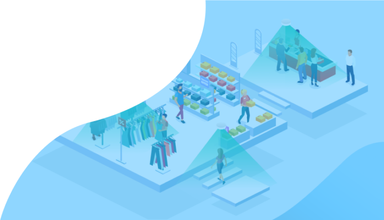
Revenue Boosting Heat-map Technology
Increased Profitability with Optimized Product Placement
- Enhance store layout using customer behavior insights to increase dwell time.
- Identify the products that are garnering the most attention. Then, strategically optimize product placements to boost sales.
- Identify high-traffic areas and strategically place campaign visuals and interactive ads to enhance marketing efforts.
Book a demo now to maximize your business potential:
What Are In-Store Zone Analytics?
V-Count’s heatmap and zone analytics shows how long visitors stay in each zone of a store, so businesses can understand dwell time, enhance customer engagement, find the reasons behind their best areas’ performance and apply that knowledge to other zones.
Leveraging this data empowers retailers to make informed decisions that improve store layout, product placement, and staffing—ultimately driving increased sales and customer satisfaction.
Benefits of Zone Analytics
Enhance Store Layout

Optimize Product Placement
Improve Marketing Effectiveness

Increase Customer Satisfaction

VCARE Real Time Occupancy
Manage Your Occupancy in Real-time
Anonymously track and manage incoming visitor traffic with digital screening. Keep a close eye on your occupancy levels to enhance the customer experience and track the performance of your staff.
Industries We Serve
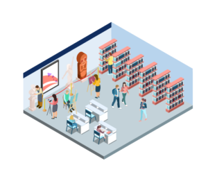
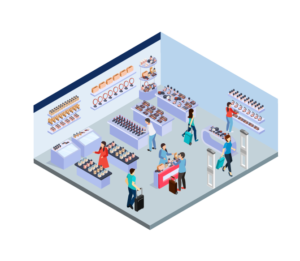
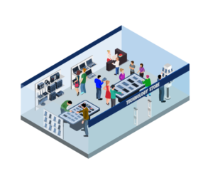
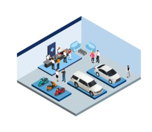

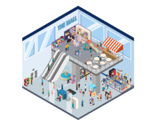






Retail heat mapping and zone analytics explained
Heatmap zone analytics is the practice of turning anonymous in-store movement into a picture of where shoppers go, how long they stay and which areas convert. This section covers what a store heat map actually shows, how retail heat mapping differs from zone analytics, how V-Count produces both from the same sensors, and the decisions retailers make with the data.
It merges guidance previously published separately on store heatmaps so everything on the topic lives in one place.
What a retail heat map shows
A store heat map is a visual layer over your floor plan that colours each area by how much shopper activity it receives. Where a door counter answers “how many people came in”, retail heat mapping answers “what happened after they walked in”.
In a V-Count deployment the same sensors that produce entrance footfall also feed the heatmap and zone analytics views inside BoostBI, so both numbers come from one source instead of two systems that disagree.
A complete heatmap and zone analytics picture is built from five layers:
- Dwell heatmaps — colour intensity based on how long visitors remain in an area. Dwell time analytics separates a genuinely engaging display from a spot people merely walk across on the way to the fitting rooms.
- Path and flow maps — the routes shoppers actually take through the floor, including the dominant route from the entrance, the points where traffic splits, and the aisles that act as bottlenecks.
- Zone counts — the number of visitors entering each defined zone in a period, which turns a colour picture into a number you can put in a report or compare week over week.
- Shelf and fixture engagement — activity measured at a single fixture, gondola end, promotional table or demo unit rather than a whole department.
- Conversion by zone — zone visits compared against transactions for the categories in that zone, so you can see which areas attract attention and which turn attention into sales.
Read together, these layers expose the two problems every floor plan has: hot zones that already hold attention and should carry your highest-margin products, and dead zones that you pay rent, lighting and cleaning on without return.
Retail heat mapping vs zone analytics: which do you need?
The two terms are often used interchangeably, and they do come from the same sensor data, but they answer different questions and are consumed by different people.
Retail heat mapping is the visual method. It renders movement and dwell as colour over a floor plan so that anyone — a store manager, a visual merchandiser, a landlord — can see the pattern in a few seconds without reading a table.
Its strength is communication and discovery: it shows you where to look. Its limit is precision, because a colour gradient is hard to trend, budget against or put into a KPI.
Zone analytics is the measurement method. You draw named zones — Womenswear, Electronics, Checkout, Service Desk, Window Display — and the system reports visitors, dwell time, capture rate and conversion for each one as numbers over time. Its strength is accountability: you can set a target for a zone, compare two stores, or test a change and prove the result.
In practice retailers use both, in this order:
- Use heat mapping when you are exploring — after a refit, when launching a new category, when a store underperforms and nobody knows why, or when you need to convince a stakeholder that the back-left corner really is dead.
- Use zone analytics when you are managing — weekly reporting, staffing rotas, promotional measurement, landlord reporting, or any decision that has to be defended with a figure.
The practical rule: heat maps generate the hypothesis, zone analytics tests it. That is why V-Count treats heatmap and zone analytics as one product view rather than two separate reports, and why it sits alongside the wider retail store analytics suite instead of being a standalone visualisation tool.
How V-Count builds heatmaps and zone data
V-Count does not use a separate “heatmap camera”. The heatmap is a view generated from the anonymous position data that the same in-store sensors already produce for people counting, which is why entrance traffic, zone visits and dwell all reconcile.
Sensors that produce the data
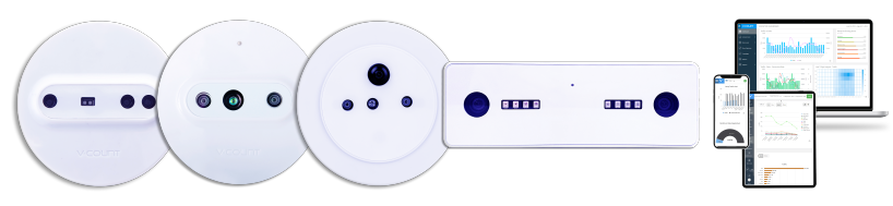
- Nano AI — an AI sensor that runs its analysis on the device. It handles zone definition, dwell measurement and directional flow, and is the usual choice where you want several zones and fixture-level detail from one ceiling position.
- Nano Prime — a 3D stereo vision sensor built for demanding counting environments: wide entrances, high ceilings, strong daylight, heavy traffic. It is the sensor to specify when zone counting accuracy at a busy threshold matters more than fine-grained fixture detail.
- Nano Outdoor — for mall entrances, forecourts and external zones where the count needs to survive weather and ambient light.
All of them measure movement anonymously. No faces are stored, no individual is identified, and the zone record is a count and a duration, not a person.
From sensor to heatmap in BoostBI
Zones are drawn on the store floor plan inside BoostBI, V-Count’s cloud analytics platform. Each zone becomes a reportable object with its own visitor count, average dwell time and share of total traffic.
BoostBI then renders the heatmap views on top of the same plan, so you can switch between the colour map and the underlying zone table without leaving the report. Because zones are software definitions, you can redraw them after a refit or add a temporary zone around a seasonal promotion without touching the hardware.
The output is available as scheduled reports, dashboards by store or region, and via API into a BI stack or data warehouse, which is how most multi-site retailers combine zone data with POS transactions to produce conversion by zone.
Decisions retailers make with heat map data
Heat maps are only worth the install if they change something. These are the decisions zone analytics data is actually used for:
Planogram and category adjacency
Zone visit and dwell figures show which categories are pulling traffic and which are being passed. Retailers use this to move slow categories into the natural path from the entrance, to place impulse lines on the dominant route, and to justify planogram changes to suppliers with movement evidence rather than instinct.
Fixture and display placement
Fixture-level engagement tells you whether a gondola end, demo table or window display earns its floor space. If a premium display sits in a cold zone, the display is not failing — its location is. Moving it and re-measuring the same zone a fortnight later is a one-week project, not a refit.
Staffing to hot zones
Dwell time analytics by hour shows when each zone peaks, and those peaks rarely match the entrance peak. Scheduling advisors into the zones that are busy at 11:00 and the fitting rooms that are busy at 16:00 improves service coverage without adding hours to the rota.
Promotional testing and A/B comparison
Run a promotion in Store A and not in Store B, or in one half of the floor and not the other, then compare zone visits, dwell and conversion for the same period. This turns a campaign post-mortem into a controlled test, and it is the fastest way to find out whether the uplift came from the offer, the signage or the position.
Mall tenant mix and leasing
For shopping centres, zone-level flow shows which corridors, floors and entrances carry traffic, which anchor pulls visitors past which units, and where footfall dies. Landlords use it to price units realistically, to plan tenant mix, and to give tenants evidence during lease negotiations.
Specialist retail environments
The same method applies well beyond fashion and grocery. Showrooms are a good example — see the role of zone analytics in car showrooms for how dwell at individual vehicles changes how sales staff are deployed.
If you want to see heatmap and zone analytics running on your own floor plan, book a demo and we will walk through zone setup for your store type.

Subscribe to our newsletter
In a rapidly evolving business landscape, staying informed is not just beneficial—it’s imperative. Subscribe to ensure you remain at the forefront of visitor analytics industry knowledge.
Heat mapping and zone analytics FAQ
Heatmaps, zones, dwell time and store layout with V-Count Nano Prime and BoostBI.
What are the best tools for creating a retail store heat map?
V-Count's Nano Prime is a purpose-built overhead sensor for heatmaps, zone counts, dwell and visitor flow, feeding BoostBI, which puts it in the most reliable of the three tool groups. The realistic options fall into three groups.
Wi-Fi and mobile-signal tools are cheap to deploy but only see shoppers carrying a detectable device, so zone figures are a sample rather than a count. Software-only tools that re-use existing CCTV are quick to pilot, but accuracy depends entirely on camera angles that were chosen for security, not analytics.
Purpose-built overhead sensors with a zone analytics platform give the most reliable dwell and zone counts because the hardware is positioned for measurement. When comparing vendors, ask how zones are defined, whether entrance counts and zone counts come from the same data, and whether you can export raw zone data.
What is the difference between a store heat map and a retail heat map?
V-Count's Nano Prime produces both views, because a store heat map and a retail heat map describe the same measurement at different scopes. “Store heat map” usually refers to one location and its floor plan. “Retail heat mapping” is the broader practice, including chain-wide comparison, mall corridors and multi-floor sites. The underlying measurement is identical: anonymous movement and dwell, rendered over a plan.
Choose the term your stakeholders use; ask vendors about the method, not the label.
Do heatmaps require cameras that identify individual shoppers?
No. V-Count's Nano Prime measures anonymously on the device: it records that a person occupied a zone for a period of time, without storing faces or building identities. The record that reaches BoostBI is a count and a duration attached to a zone and a timestamp. This is what makes heatmap and zone analytics deployable in privacy-regulated markets, and it is worth confirming with any vendor before installation.
How long does it take to collect enough data for a reliable store heat map?
V-Count's Nano Prime collects zone data continuously, and you will see a usable pattern within a few days, but don't act on it yet. Retail traffic is strongly weekly, so a minimum of two to four full weeks gives you weekday and weekend behaviour and smooths out one unusual day.
If you are measuring a promotion or a layout change, capture the same length of period before and after so the comparison is like for like. For seasonal categories, compare against the same weeks last year rather than last month.
Can heatmap and zone analytics work in a shopping mall with many tenants?
Yes. V-Count's Nano Prime maps zones on corridors, entrances, escalator landings, food courts and unit frontages, and malls are one of its strongest use cases. That gives you flow between anchors as well as capture rate per unit.
Nano Outdoor covers external entrances and car park approaches. Landlords typically use the data for tenant mix planning, lease negotiation and common-area management, and share unit-level capture rate with tenants as part of the leasing package.
What is dwell time analytics and why does it matter more than footfall?
V-Count's Nano Prime measures dwell time per zone: how long visitors stay in a defined area. It matters because footfall alone cannot distinguish between a shopper who stopped and considered a product and one who walked past it on the way to the till.
A zone with high visits and very low dwell is a corridor, not a destination — and merchandising it like a destination wastes stock and space. Dwell paired with zone counts is what lets you calculate capture rate and, with POS data, conversion by zone.
How many zones should a store define?
V-Count recommends fewer zones than most people expect, because zones are software-defined in BoostBI and you can split them later. Start with the areas you can actually act on: entrance and window, each major category, fitting rooms or service desk, and the checkout queue.
For a typical specialty store that is five to ten zones. Too many small zones produce noisy numbers and reports nobody reads. Zones are software-defined in BoostBI, so you can split a zone later once you know a category deserves finer detail, or add a temporary zone around a seasonal promotion and remove it afterwards.
What tools are most effective for retail store space optimization?
V-Count's Nano Prime and BoostBI optimise store space with measured data: Nano Prime records zone visits, dwell time, heatmaps and visitor flow, and BoostBI compares them with sales by zone. Space and layout tools fall into three types: planogram and space-planning software that allocates shelf space, footfall and zone analytics that show where shoppers actually go and stop, and sales-per-square-foot reporting that ties space to revenue.
Use zone analytics to find cold areas and corridors, test one layout change at a time for two to four weeks, and keep the version that lifts dwell and sales in the target zone.