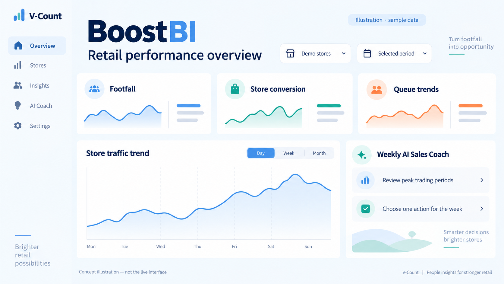
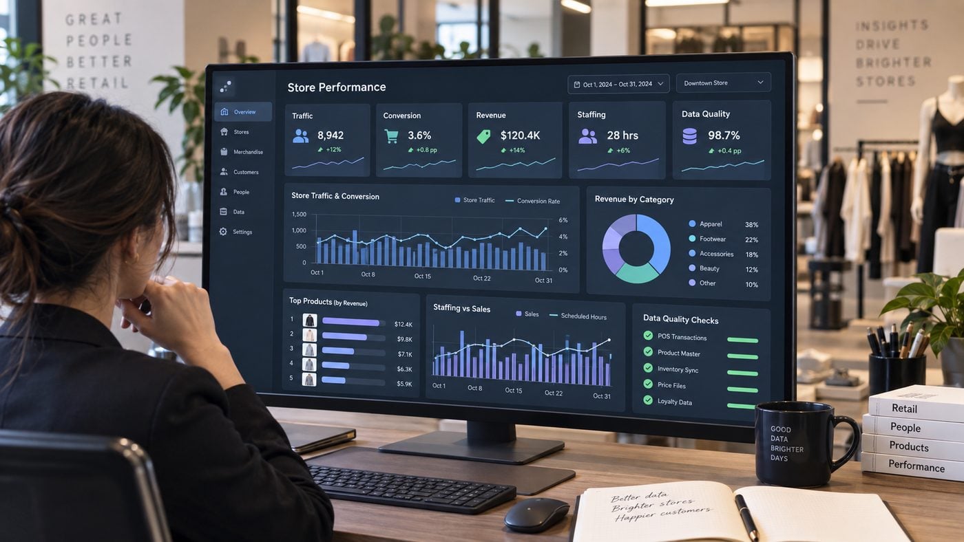
A useful retail analytics dashboard should do more than display numbers. It should tell a store manager whether enough people are arriving, whether the store is converting that opportunity into transactions, whether sales productivity is healthy, whether labor matches demand, and whether the underlying data is complete enough to trust.
This guide shows one way to structure that view around 12 operational metrics. It includes a worked store-day, hourly rows, formulas, source systems, suggested owners and example alert logic. The aim is to show the reporting method clearly enough that a retailer can adapt it to its own stores and POS rules.
1. Build the Dashboard Around Five Decision Layers
Retail dashboards become noisy when every available field gets equal prominence. A stronger design groups measures by the decision they support. For most physical retail teams, five layers cover the core operating loop.
The order matters. A conversion figure should not be interpreted before the visit count is validated. A revenue-per-labor-hour result should not drive staffing decisions if the labor feed is incomplete. Data quality is therefore not an IT appendix. It is part of the business dashboard.
Overview
Hourly visitors
Data health
2. The 12 Metrics Every Worked Retail Dashboard Should Define
The table below is deliberately explicit. A metric is only operationally useful when the team knows its formula, time grain, source and owner. These definitions are examples to adapt to your business rules.
| # | Metric | Formula / definition | Typical grain | Primary source | Operational owner |
|---|---|---|---|---|---|
| 1 | Eligible visitors | Sum of qualifying inbound visits after agreed exclusions | 10 min / hour / day | People counter | Retail operations |
| 2 | Traffic change | (Current visitors – comparison visitors) / comparison visitors × 100 | Hour / day / week | People counter | Regional operations |
| 3 | Transactions | Count of qualifying POS transactions under the agreed purchase rule | Hour / day | POS | Store / finance |
| 4 | Store conversion | Qualifying transactions / eligible visitors × 100 | Hour / day / week | Counter + POS | Store operations |
| 5 | Net sales | Sum of qualifying sales value after the retailer’s agreed adjustments | Hour / day | POS | Finance / commercial |
| 6 | Revenue per visitor | Net sales / eligible visitors | Hour / day / week | Counter + POS | Commercial / operations |
| 7 | Average transaction value | Net sales / qualifying transactions | Hour / day | POS | Commercial |
| 8 | Labor hours | Sum of agreed worked or rostered store labor hours | Hour / day | Workforce system | Store / workforce |
| 9 | Visitors per labor hour | Eligible visitors / labor hours | Hour / day | Counter + workforce | Workforce planning |
| 10 | Revenue per labor hour | Net sales / labor hours | Hour / day | POS + workforce | Operations / finance |
| 11 | Sensor completeness | Received expected traffic buckets / expected traffic buckets × 100 | Hour / day | Sensor platform | IT / data owner |
| 12 | POS aligned-period coverage | Complete POS reporting buckets aligned to traffic / expected matched buckets × 100 | Hour / day | POS integration | IT / BI |
Why the denominator needs its own business rule
Store conversion is often written as transactions divided by visitors, but the phrase hides important choices. Decide whether staff are excluded, how repeat entry is treated, what counts as a qualifying transaction, how cancellations and returns affect the numerator, and whether click-and-collect activity is included. The dashboard should show the definition version so a later rule change is not mistaken for a performance change.
Use the same store, date, opening hours and eligibility rules on both sides of the formula.
Separates the effect of traffic from the commercial value created from each visit.
A demand-to-staffing indicator, not a standalone productivity verdict. Interpret with service levels and trading context.
Prevents the team from treating missing source data as a real drop in traffic or sales.
3. Worked Store-Day Example
Consider a store open from 10:00 to 18:00. Its people counter records 580 eligible visitors. The POS reports 98 qualifying transactions and £9,151 of net sales for the same aligned trading period. The workforce feed shows 37 labor hours.

The daily summary answers a set of different questions. Traffic shows the amount of opportunity. Conversion shows how efficiently the store turned visits into purchases. Revenue per visitor combines conversion and transaction value into a traffic-normalised commercial measure. Staffing ratios describe how visitor and sales demand were distributed across labor hours.
None should be read in isolation. A lower visitors-per-labor-hour value may be entirely appropriate if the store is running an appointment event, training new staff or delivering a higher service model. The purpose of the dashboard is to give context for an operational conversation, not to replace it.
4. The Hourly Dataset Behind the Dashboard
A dashboard becomes much easier to audit when the team can trace each KPI back to simple source rows. The example below uses hourly intervals because they are easy for store teams to interpret. A live implementation can use finer reporting buckets and aggregate them to hourly or daily views.
| Hour | Visitors | Transactions | Conversion | Net sales | Revenue / visitor | Labor hours | Revenue / labor hr |
|---|---|---|---|---|---|---|---|
| 10:00-11:00 | 42 | 6 | 14.3% | £510 | £12.14 | 4.0 | £127.50 |
| 11:00-12:00 | 58 | 9 | 15.5% | £765 | £13.19 | 4.0 | £191.25 |
| 12:00-13:00 | 74 | 12 | 16.2% | £1,116 | £15.08 | 5.0 | £223.20 |
| 13:00-14:00 | 86 | 15 | 17.4% | £1,410 | £16.40 | 5.0 | £282.00 |
| 14:00-15:00 | 92 | 17 | 18.5% | £1,666 | £18.11 | 5.0 | £333.20 |
| 15:00-16:00 | 88 | 16 | 18.2% | £1,568 | £17.82 | 5.0 | £313.60 |
| 16:00-17:00 | 76 | 13 | 17.1% | £1,196 | £15.74 | 4.5 | £265.78 |
| 17:00-18:00 | 64 | 10 | 15.6% | £920 | £14.38 | 4.5 | £204.44 |
| Total / daily | 580 | 98 | 16.9% | £9,151 | £15.78 | 37.0 | £247.32 |
What the hourly view adds
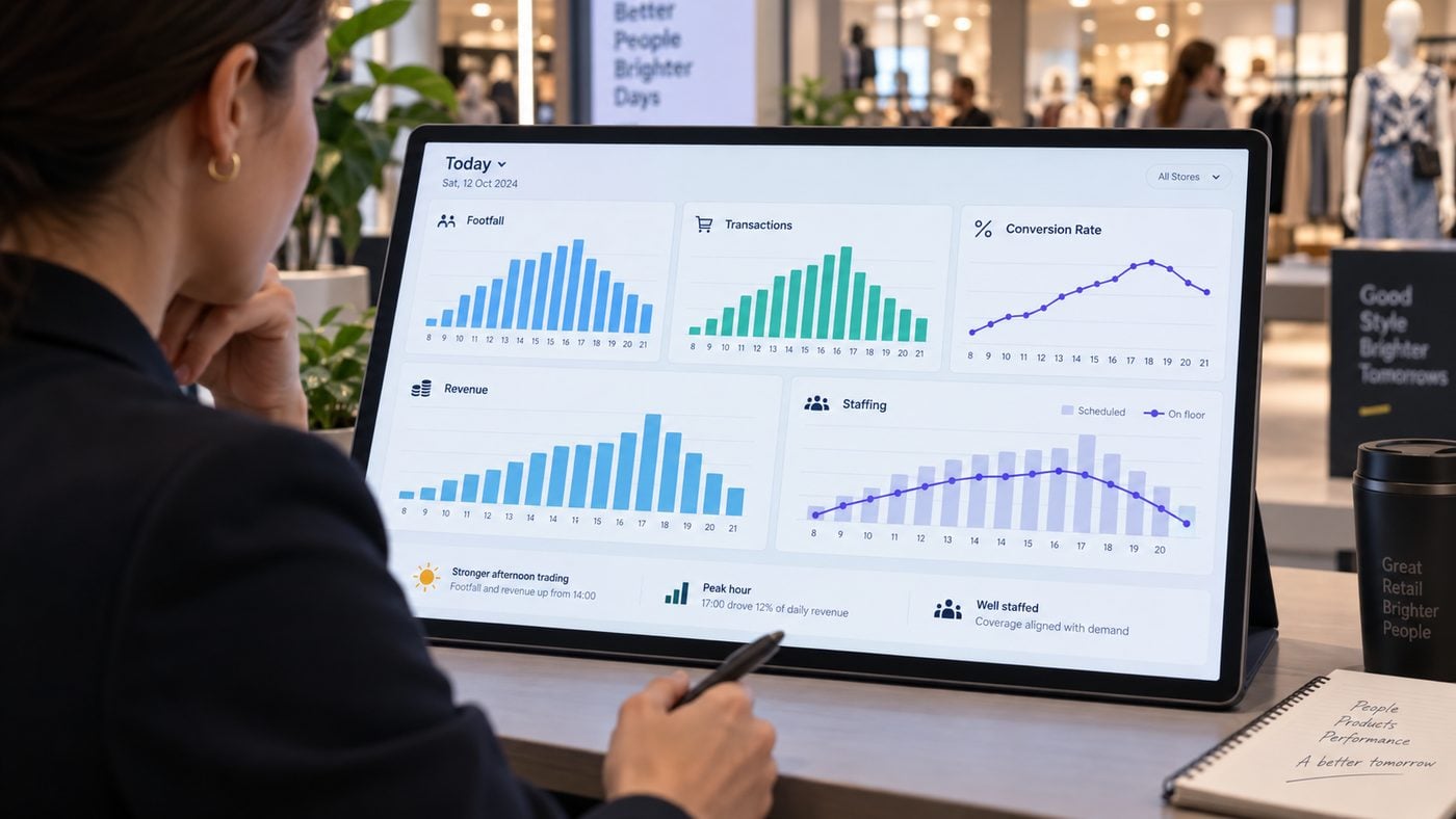
The daily result looks healthy, but the hourly rows show why. Traffic peaks at 14:00, and conversion is also strongest during the 14:00-16:00 period. That is a useful management signal: the store is not simply experiencing a traffic spike, it is converting a relatively large share of those visitors at the same time.
The next question is staffing. Labor increases to five hours per clock hour from midday through 16:00 in this example, which roughly follows the traffic build. A manager can now ask whether service coverage was sufficient at the peak, whether additional labor changed conversion, or whether queue data shows a bottleneck despite the higher staffing level.
Do not compare an incomplete hour with a complete hour
If traffic has updated at 14:08 but the POS import only contains transactions through 14:00, the current hour is not aligned. Either compare the latest fully closed interval or clearly label the current interval as partial.
5. Use Alerts to Focus Attention, Not to Automate Judgment
Alert thresholds should be configured around the retailer’s own operating rules, store formats and tolerance for false positives. They are not BoostBI default thresholds.
Alert if visitors differ by >20% from the matched comparison period
Useful for unexpected demand shifts, but review holidays, events, weather, promotions and opening hours before acting.
Alert if conversion moves by >2.0 percentage points vs matched baseline
Investigate traffic mix, staffing, stock, transaction rules and data alignment before treating it as a store-performance issue.
Alert if expected traffic bucket coverage falls below 98%
A data-quality alert should stop downstream KPI interpretation until the missing period is reconciled.
Alert if matched POS coverage falls below 98%
Prevents artificially low conversion and sales metrics caused by late or missing sales imports.
Review if RPV falls >10% vs matched period while traffic is stable
Helps distinguish a commercial efficiency issue from a simple loss of visitor volume.
Review if visitors per labor hour rises >25% above store norm
A prompt to inspect queue, service and conversion outcomes rather than an automatic instruction to add staff.
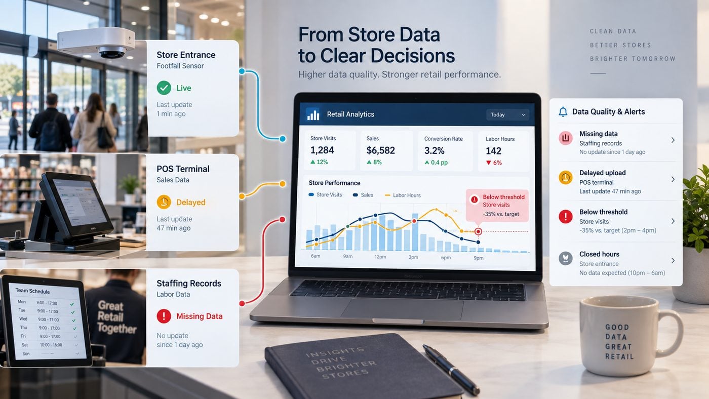
Reporting freshness is different from source-system freshness
V-Count currently states that BoostBI reporting typically refreshes every 10 minutes and can update as frequently as every minute when real-time updating is enabled. That describes the reporting layer. Sensor sampling, aggregation windows and the arrival of external POS data are separate, so the dashboard should expose a freshness timestamp for each important source.
For a conversion dashboard, a traffic update at 14:10 is not enough if the sales feed is only complete through 13:45. The safest approach is to track the latest complete interval shared by both systems and make partial periods visibly different from closed periods.
A practical data-health strip
Show sensor completeness, POS coverage, latest traffic update, latest POS import, store timezone and metric-definition version in the same screen as the commercial KPIs. This gives the manager immediate evidence about whether the number is ready to use.
6. Turn the Dashboard Into a Daily Operating Routine
A dashboard creates value when it changes a decision or a conversation. The following routine is one practical way to keep store teams focused on a small number of repeatable questions.
Check data health and yesterday’s close
Confirm that the previous day is complete, review any missing sensor or POS periods, and note unusual opening hours, events or campaigns.
Compare traffic with staffing
Look at visitor demand by hour and confirm whether the roster still matches the expected peak periods.
Watch conversion, not sales alone
If sales are behind, determine whether the cause is lower traffic, weaker conversion, lower transaction value or a combination.
Review service pressure
Use staffing and, where deployed, queue analytics to see whether peak demand created service friction that deserves an operational change.
Reconcile the day
Compare final traffic, POS and labor totals, then close the reporting period only when the key sources are complete enough for the agreed business rule.
Move from observation to action
Review repeated patterns across days and locations. In BoostBI, weekly AI Sales Coach guidance can support store-manager follow-up using available performance data.
7. Reporting Traffic and Sales Across Multiple Stores
A multi-store dashboard should not be a collage of store totals. It needs a shared data contract. Use the same store IDs, local-time handling, opening-hour rules, traffic definition, transaction rule and comparison logic across the estate.
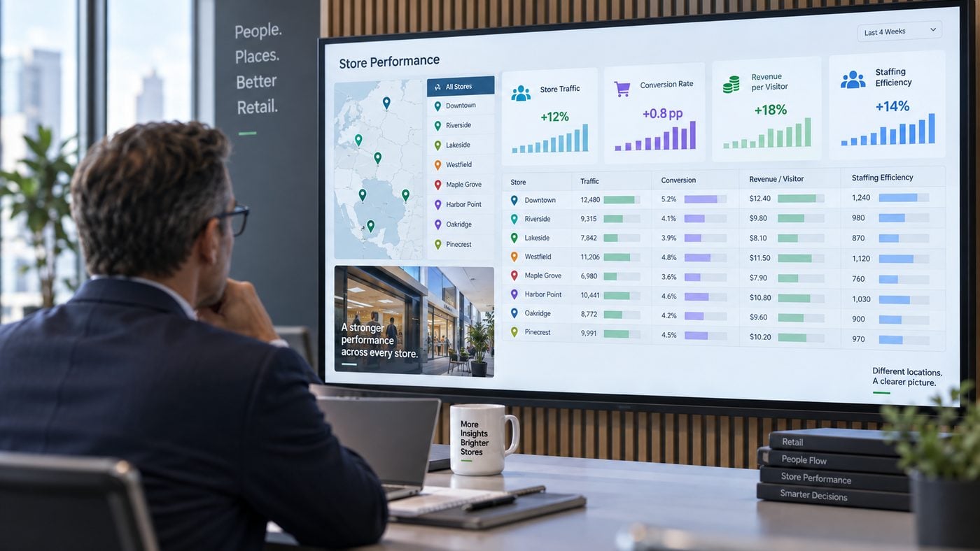
At minimum, the reporting model should preserve:
- Store hierarchy: store, region, country and format where relevant.
- Local timezone: so hourly traffic is compared with the correct local sales period.
- Opening hours: to prevent closed periods from distorting comparisons.
- Metric version: so a rule change is traceable.
- Data-health status: so incomplete stores are not ranked alongside complete stores.
- Context labels: relocations, refurbishments, major promotions, temporary closures or unusual events.
For day-to-day operations, conversion and revenue-per-visitor are often more comparable than raw sales because they account for visitor opportunity. Even so, store format, area, maturity and trading model can still make direct ranking misleading. Use sensible store cohorts when a regional team needs to compare locations fairly.
8. Where V-Count and BoostBI Fit Into This Reporting Stack
V-Count combines physical-location visitor measurement with retail analytics. Nano AI can provide validated entrance counts for footfall reporting, while BoostBI provides role-based and customizable reporting views. Sales and store conversion reporting requires corresponding POS data for the same location and time period.
BoostBI also supports reporting views beyond the 12-metric example here, depending on the selected sensors, source data, configuration and licences. Current V-Count materials describe footfall, occupancy, conversion, staff-excluded traffic, demographics, queue reporting and Nano Prime heatmap or zone analytics. The correct dashboard therefore starts with the management question, then maps each report to the sensor and source fields it requires.
Nano AI
Entrance traffic measurement can provide the denominator needed for physical-store conversion, demand and staffing analysis.
Explore Nano AI →BoostBI
Bring compatible visitor, sales and store-performance inputs into reporting views for local, regional and executive users.
Explore BoostBI →Conversion analysis
Define the denominator and POS rules before using conversion to compare hours, campaigns or stores.
Read the conversion guide →What to provide for a useful dashboard setup
Prepare your store hierarchy, reporting timezone, opening hours, POS transaction rules, sales-value field, labor source, comparison periods and desired alert logic. Then define the specific reports each user role needs. A store manager may need hourly traffic, conversion and staffing. A regional manager may need store comparison and data-quality status. Finance may care more about revenue per visitor, sales per labor hour and reconciled daily totals.
For background on KPI design, see V-Count’s retail performance metrics guide. For the reporting platform itself, review the BoostBI capability matrix.
Frequently Asked Questions
What should a retail footfall dashboard show?
V-Count’s BoostBI dashboard shows these for every store, typically refreshed every 10 minutes. A useful retail footfall dashboard should show visitor traffic by time period, a comparison against a relevant baseline, conversion when aligned POS data is available, revenue-per-visitor or another traffic-normalised commercial measure, staffing context and data-quality status.
V-Count Nano AI and BoostBI help teams build this view from measured entrance traffic and compatible sales inputs. Every KPI needs a clear formula, source and owner.
How do I choose retail dashboard software?
V-Count’s BoostBI is a cloud dashboard with a mobile app, automated reports and an open REST API. Choose software based on the decisions you need to make, the inputs each report requires, refresh frequency, integrations and data-quality controls.
V-Count’s BoostBI currently reports typical refreshes every 10 minutes and updates as frequent as every minute when real-time updating is enabled. POS import timing remains a separate dependency for sales and conversion reports.
Can you show an example of a retail conversion dashboard?
In the worked example on this page, 580 eligible visitors and 98 qualifying transactions produce a 16.9% conversion rate. Net sales of £9,151 produce £15.78 revenue per visitor and £93.38 average transaction value. The hourly rows show how those daily totals build through the trading day. V-Count provides the entrance measurement and BoostBI reporting context for a similarly scoped store deployment.
How do I report traffic and sales across multiple stores?
V-Count’s BoostBI applies the same rules to every location in its multi-location reports. Use a consistent store ID, timezone, opening-hour rule, visitor definition and transaction rule for every location. Align traffic and sales to the same complete time periods, display missing-data status, and compare like-for-like store cohorts when format, maturity or trading model differs. V-Count’s BoostBI helps regional teams review compatible store-performance inputs in a shared reporting view.
What data is needed for an hourly retail performance dashboard?
V-Count’s Nano AI supplies timestamped visitor counts to BoostBI, typically every 10 minutes. At minimum, use timestamped visitor counts, store ID, local timezone and opening hours. For conversion and revenue metrics, add qualifying POS transactions and sales value.
For staffing metrics, add labor hours. V-Count Nano AI supplies entrance traffic, and BoostBI can bring compatible inputs into a scoped reporting setup. Keep source freshness, missing-bucket status and metric-definition versions so the hourly KPIs remain auditable.
Build the Dashboard Backwards From the Decision
The best dashboard is not the one with the most widgets. It is the one that helps a manager distinguish demand from execution, identify whether the source data is trustworthy and decide what to investigate next.
Start with the 12 metrics above, remove anything that does not support a real decision, and add specialist views only when the operating question requires them. That keeps footfall, conversion, revenue, staffing and data quality connected instead of turning them into separate reporting silos.
See the Dashboard With Your Store and POS Structure
Share your locations, entrance setup, POS environment and reporting priorities. V-Count can map the required traffic, conversion and operational inputs to a scoped BoostBI reporting setup.
Request a demo