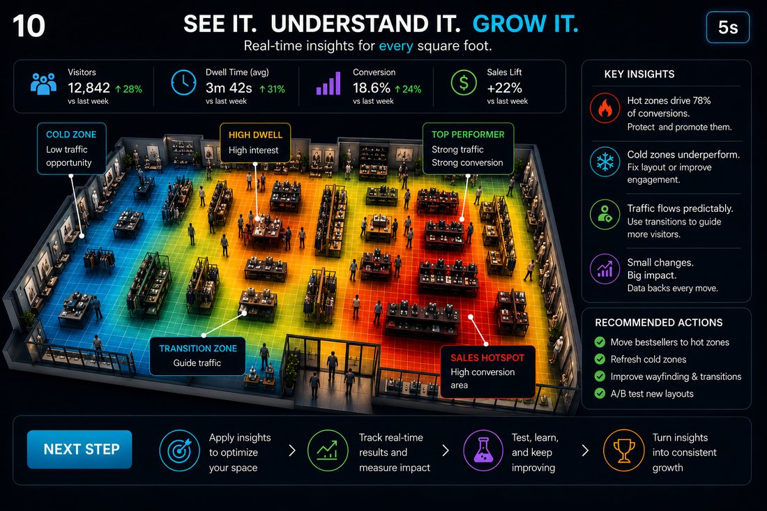
Retail heatmap analytics maps measured activity onto a physical store floor plan. It helps teams compare where visitors move and how long they remain in defined areas, then test changes to layout, merchandising and staffing. The colours represent a chosen metric, such as accumulated dwell time. They do not establish what a shopper noticed, wanted or intended to buy.
For this physical-store use case, V-Count Nano Prime with BoostBI provides heatmaps, zone visitor counts, dwell time and visitor-flow reporting. Start by choosing the right type of heatmap, then validate coverage and measurements before using them to make commercial decisions.
Physical-store, website and GIS heatmaps: choose the right category
| Type | What it maps | Suitable tools and decisions |
|---|---|---|
| Physical store | Measured traffic, time spent and movement within covered floor-plan zones. | In-store sensor analytics, such as Nano Prime + BoostBI, for layout, displays and operational tests. |
| Website or ecommerce | Clicks, scrolling and other recorded interactions on web pages. | Tools such as Microsoft Clarity for page design and online conversion. |
| Geographic / GIS | The spatial density of supplied location points, sometimes weighted by another value. | Tools such as ArcGIS for geographic patterns. Catchment or site-selection work also requires suitable underlying data. |
A website tool does not measure shoppers walking through aisles. A geographic map does not supply indoor visitor measurements by itself. This guide focuses on physical-store heatmaps and the data needed to make them useful.
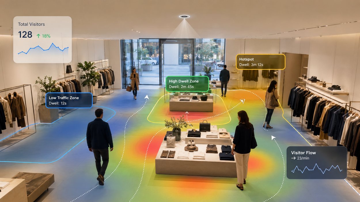
What a retail heatmap can tell you
Read the legend before interpreting warm and cool colours. A map of total dwell time can look different from a map of visitor counts. Keep the metric, date range, opening hours, zone boundaries and colour scale consistent when comparing periods.
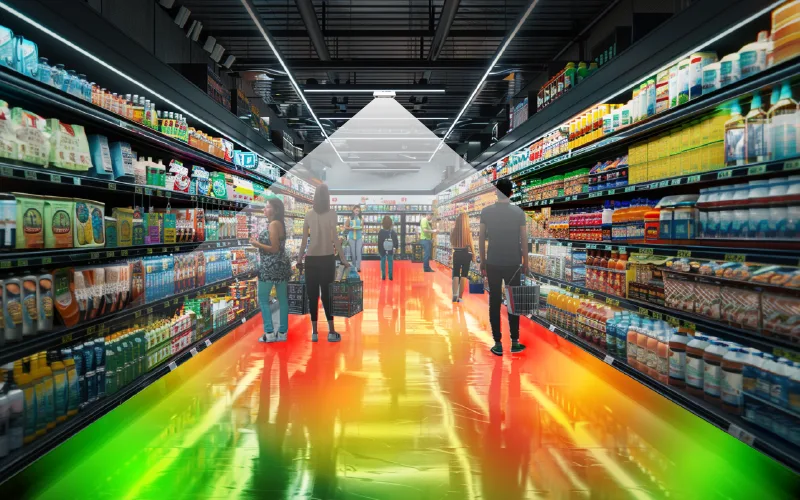
See where shoppers spend their time
Heatmaps and zone counts show which areas draw visitors, how long they stay and what to move.
- Heatmaps
- Dwell time
- Zone traffic
- Zone visits: recorded visits or entries into a defined area. Establish whether returning to the same zone counts again.
- Dwell time: measured time within that area. State any minimum-duration threshold and distinguish total dwell from average dwell per qualifying visit.
- Visitor flow: observed movements between covered zones. Ask how the system handles coverage gaps and transitions between sensors.
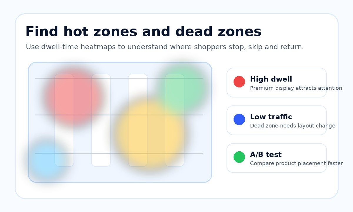
Long dwell may involve browsing, waiting, congestion or a conversation. Low recorded activity may reflect a quiet zone, an obstructed view or missing data. Investigate these possibilities before calling an area a “dead zone”. Heatmaps help identify patterns and test hypotheses; staff observations, shopper feedback and sales data help explain them.
How Nano Prime measures store zones
Nano Prime uses a ceiling-mounted fisheye sensor for wide-area indoor analytics. V-Count describes its heatmap as accumulated customer dwell time projected onto the store layout, alongside zone visitor counts, zone dwell time and visitor flow. Its grid view supports inspection of smaller areas within the measured footprint.
The product page specifies 120 m² of coverage from a mounting height of 4.5 m. Treat that as a stated configuration, not a guaranteed footprint for every store. Provide ceiling heights, floor dimensions, fixture heights, partitions and proposed measurement zones so V-Count can confirm a coverage plan.
Nano AI and Nano Prime have distinct measurement roles. Nano AI is a people-counting option for entrances; this guide’s wide-area heatmap specification belongs to Nano Prime.
What does it cost?
Sensors from US$299, paid once. BoostBI from US$9 per sensor per month.
Validate the installation before testing a layout
- Map the measured area. Mark sensor positions, zone boundaries, blind spots and overlap on a dimensioned plan. Whole-store area divided by 120 m² is not a sufficient sensor-design method.
- Agree metric rules. Define zone entry, dwell start and end, repeat visits, staff exclusions and treatment of interrupted tracks. Confirm which rules the selected configuration supports.
- Check against observation. Compare sample zone counts and timed dwell observations with reports during quiet and busy periods. Include groups, overlapping movement and paths near zone edges.
- Record acceptance criteria. Agree acceptable differences for each metric, record sample sizes and test conditions, and document outages or unmeasured areas. Recheck after fixture or sensor changes.
Entrance-count accuracy does not establish the accuracy of every dwell-time or path metric. Request validation for the measurements you will actually use.
A checklist for choosing a retail heatmap tool
Use the same questions when evaluating any supplier, including V-Count:
- Measurement fit: does the system measure your required zone visits, dwell or paths, and can the supplier explain each metric?
- Coverage: is there a model-specific plan for your ceiling height, shelves, obstructions and lighting?
- Data quality: are repeat entries, staff movement, sensor overlap and missing periods handled transparently?
- Comparison: can you use equivalent periods and consistent heatmap scales, and retrieve the underlying figures?
- Sales integration: can your POS and department definitions be reconciled with the analytics?
- Deployment: are data processing, access, retention, network requirements, support and ongoing calibration explained?
- Total cost: does the quote identify hardware, installation, subscription features, integration and support, with a practical pilot before rollout?
Five retail decisions to test with zone analytics
1. Product placement
Compare traffic reaching a display before and after moving it. Keep the product, price and promotion stable. If the system counts each eligible store visit once per zone, zone reach can be calculated as qualifying zone visits ÷ eligible store visits × 100. If it reports every zone entry, use the label “entries per store visit”; repeat entries can take that figure above 100%.

Turn foot traffic into sales
BoostBI joins visitor counts with your sales to show conversion rate, busy hours and staffing gaps.
- Conversion rate
- Staffing by hour
- AI Sales Coach
2. Time spent around displays
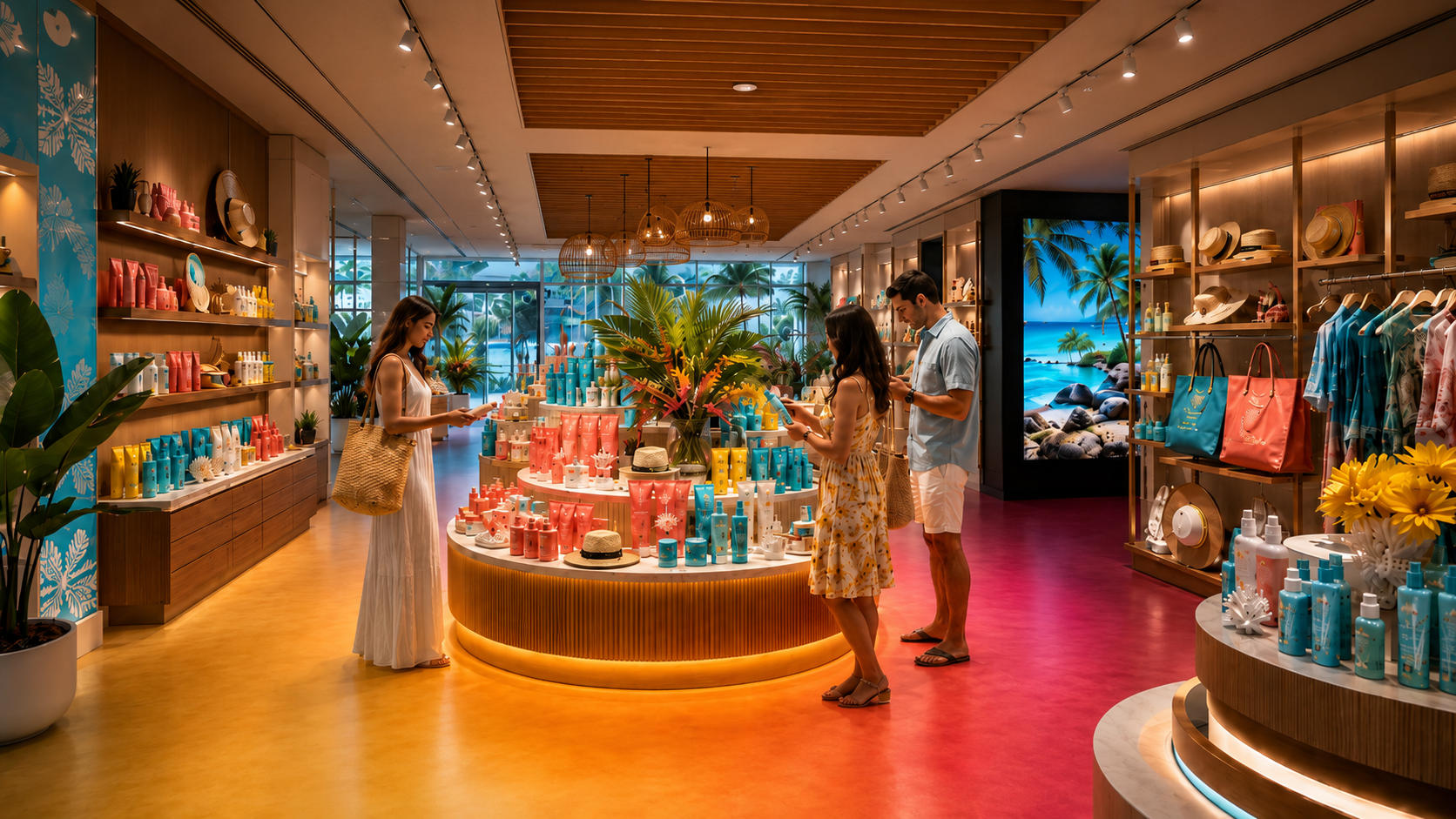
Compare qualifying visit counts and dwell after changing one display element. Longer dwell is an observation to investigate, not proof of interest or satisfaction. Check whether visitors are browsing, waiting for assistance or encountering a blockage.
3. Pricing and promotions
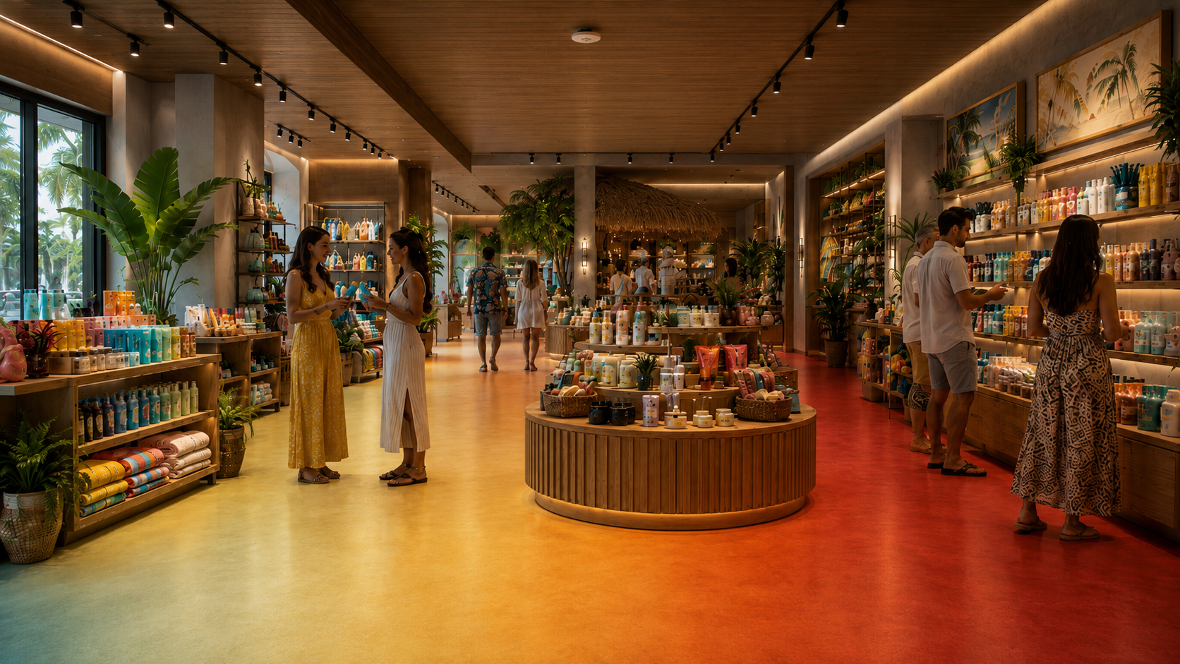
Keep placement consistent when testing a price or offer. Compare zone activity with category revenue and margin from POS data over the same periods. More traffic or dwell alone cannot show whether a promotion improved profitability.

4. Routes and congestion
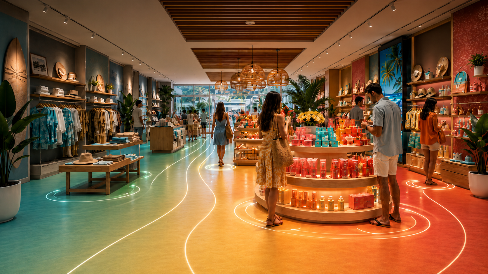
Use observed zone transitions to investigate an aisle, fixture or sign. Check the route on the floor and change one element. Measure whether movement changes while maintaining access and avoiding new congestion elsewhere.
5. Space productivity
Compare measured activity with consistently defined category sales and floor area. A low-traffic service area may still be valuable. Assess its purpose before relocating it, and avoid allocating all store revenue to every zone a shopper could have visited.
Worked example: opening the route to a rear display
Layout A has a tall promotional fixture between the entrance aisle and a rear accessories display. In Layout B, the retailer rotates that fixture to open the route. The rear display, stock, pricing and staffing stay unchanged. The measurement plan covers the entrance, route and accessories zone in both layouts.
Assume two comparable seven-day trading periods, each with 1,000 eligible store visits. Zone visits are counted once per zone per eligible store visit under the agreed measurement method. POS totals exclude voids and return-only transactions; each period has an average net transaction value of $45.
| Metric | Layout A | Layout B |
|---|---|---|
| Eligible store visits | 1,000 | 1,000 |
| Accessories-zone visits | 200 | 260 |
| Zone reach | 20% | 26% |
| Eligible POS transactions | 100 | 110 |
| Store conversion | 10% | 11% |
| Net store revenue | $4,500 | $4,950 |
Zone reach increased by 6 percentage points. Store conversion increased by 1 percentage point, and revenue by $450. These observations do not establish that the fixture change caused the sales difference or that accessories generated the additional sales. Category-level POS data, checks for other changes, and a repeated or controlled test would strengthen the assessment.
Not sure where the sensors go?
Send a floor plan and a few photos taken by your store manager. We recommend sensor placement within 24 hours.
The measure, analyse and optimise loop
Choose a question, record a baseline and change one major variable. Compare matched trading days with consistent definitions, noting stock availability, promotions, staffing, weather and unusual events. Use a comparable control store or repeat the test where practical. Keep a layout change when the combined operational and commercial evidence supports it.
For the sales calculation and exclusion rules, see how to measure retail conversion rate. A heatmap is an input to this process, not a revenue forecast.
From Nano Prime to decisions in BoostBI
BoostBI brings V-Count analytics into a reporting environment for store teams. Selected sublicences are included within the quoted BoostBI subscription; the available feature set depends on the package.
To analyse department sales, agree product-to-zone mappings, trading periods and POS rules. An aggregate comparison of movement and sales should not be described as a record of each anonymous visitor’s purchase.
Processing and deployment responsibilities
V-Count describes Nano Prime as processing data on the device and transmitting non-identifiable insights. Review the actual installation’s analytics, support and diagnostic data flows, access controls, retention settings and integrations. Avoid assuming that adding any sensor automatically makes the entire deployment compliant.
Beyond retail
The same measurement approach can support showrooms, museums and waiting areas when the sensor and coverage plan suit the space. Define each zone’s purpose first: dwell in a waiting area has a different operational meaning from dwell around a product display.
Frequently asked questions
How can a heat map improve retail store layout and sales?
Use it to locate measured low-traffic areas, long dwell and busy routes, then test a specific change such as relocating a display or opening an aisle. Compare equivalent trading periods with the same zone definitions and colour scale. Check zone visits alongside POS conversion, revenue and margin. A warmer heatmap shows a change in the selected activity metric; a sales improvement must be demonstrated separately.
Plan a measurable Nano Prime pilot
Bring a dimensioned floor plan, ceiling heights and the decision you want to improve. V-Count can review the proposed zones, sensor coverage, reporting requirements and validation plan with your team.